In this post I’ll describe one of the methods I use to paints animals. I enjoy this approach because of the ease of starting and the straight forward process involved. One layer being built over the next. (Click on any of the images to enlarge.)

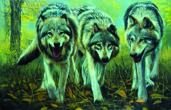
- Finished Wolf Portrait
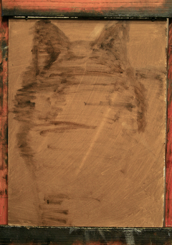
Step One: I began this painting by toning my canvas with a wash of raw umber and mineral spirits. Then using a number 4 filbert hog bristle brush I started massing in basic shapes and dividing space. Because the wolf will fill most of the canvas I am able to utilize the negative space surrounding it to draw lay in my image. Again with raw umber using mostly horizontal brush strokes.

Step One
Step Two: Continuing with only raw umber I place the features of the face and suggest where the darkest areas of the painting will be. At this point I am establishing the general area of my darks, however I’m not too concerned with values, edges etc., just massing in and placing shapes.

Step Two
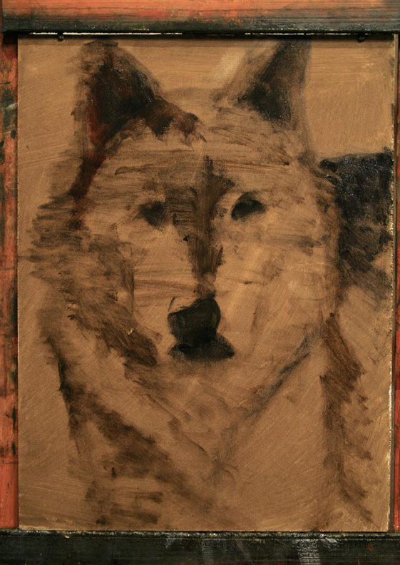
Step Three: Now that I have my features, basic shapes and spaces taken care of I want to focus on the background. By painting the background before the wolf I can ensure that in the final image the wolf feels like it is in front of the background, not the reverse. I begin by mixing Yellow Ochre and Ivory Black, which make a low chroma dark green. Starting in the upper right corner I move across to the left while adding more Yellow Ochre to the mixture. As I move down the canvas I continue to add Yellow Ochre and small amounts of Titanium White. This combination not only creates a subtle gradation of tone from the top right to bottom left, but also transitions from cool to warm. I’ll use these gradations against the outer values of the wolf’s fur for effect.

Step Three
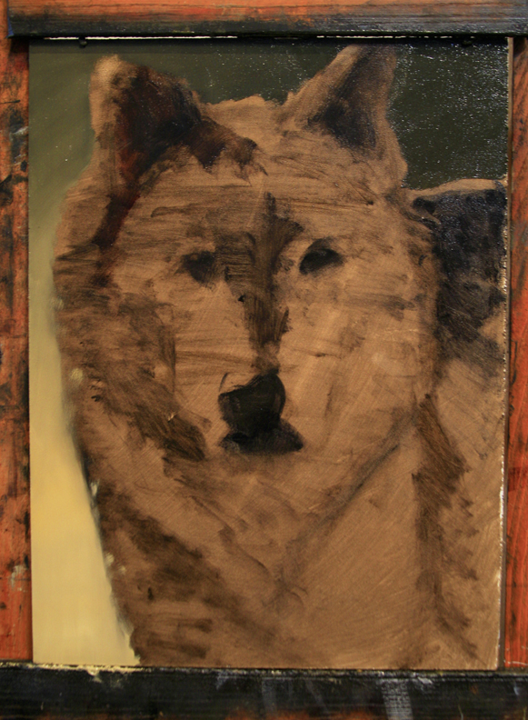
Step Four: The underpainting…When it comes to painting fur, nothing is more important than the underpainting. The values and temperatures established at this step will describe the surface fur as much as the actual brush strokes of fur themselves. The difficult part here is training your eyes to look beneath the hair and see what temperature and value lies beneath. This would be the areas where the clumps of fur “break open”. Without this crucial layer your surface fur will have nothing to contrast against.
My palette is kept simple, using only Titanium White, Yellow Ochre, Cadmium Orange, Raw Sienna, Burnt Sienna, Raw Umber, Cobalt Blue, French Ultramarine Blue and Ivory Black. With the exception of Yellow Ochre (which I will use to lighten my warm colors in lieu of White to maintain temperature and chroma, then to warm my White for the lightest surface fur) the rest of the colors can be considered either as part of the Orange or Blue color families. Thus I can use any of these complimentary combinations to create an incredibly wide variety of warm, neutral and cool gray tones in a full range of values.
Now I start laying in color and value as I identify it under the surface fur.

Step Four
Step Five: As I continue with the underpainting you can see how dark the painting is compared to the completed image. I am doing my best to lay in tones that are as accurate as possible, however it has been my experience that it is better to error on the side of too dark verses too light when underpainting. I can always lighten an area but when the fur is painted over the top it is very difficult to then paint darker values between each clump up fur.
Unless I am painting the edge of a shape or cast shadow I tend to avoid hard edges at this step. By blending the colors where they meet I can avoid having to try to cover up a hard transition edge, which usually results in overpainting the surface fur.

Step Five
Step Six: With the underpainting complete I start to lay in fur. Mixing a small amount of Raw Sienna and Yellow Ochre with Titanium White I begin to brush in the light fur on top of the head paying attention to the direction and length of the fur. I think in terms of clumps or chunks and small masses, not individual hairs. This allows me to focus on the overall flow of the fur. I am also careful not to go too light this first pass as I will be adding lighter layers in the next passes. It should be noted that I prefer to use either a filbert or long flat for fur, not a liner or round brush. Also, I try to avoid much, if any medium. While medium will allow the paint to flow easier from the brush it will also create harder edges with each stroke which can cause the fur to look stiff rather than soft.

Step Seven
Step Seven: With the top of the head started I now move down the left side of the painting establishing some of my lightest values. Immediately I get a sense of how the light will contrast against the darks and how it will work with the background. I have also started the grays in the face, ears and other side of the head with a mixture of Cobalt Blue and Raw Sienna. The dark areas are a mixture of Ivory Black with Burnt Sienna and French Ultramarine Blue.
Because the light is coming from the left and slightly to the rear the fur around the wolf’s right side of the face (our left) is experiencing what is called diffuse transmission of light. Similar to when you shine a flashlight at the back of a human ear. The light passes through the form creating an inner glow. I use a bit of Cadmium Orange and Burnt Sienna in this area to duplicate the light transmission.

Step Eight
Step Eight: With much of the initial layers of surface fur complete I can lighten my values for the next pass in each area as I begin to work towards building volume. Here is where I have to focus on temperature and values on the surface. For example, I know there is reflected light filling the chest area on the right side as well as all the planes that face towards the ground. Reflected light from the sun bounces off the surface (ground) and fills objects with a low intensity of light and is warm. There are times when this light can appear cool because of the color of the surface it reflects off of. For example a white horse in a green pasture would have green reflected light on its stomach. However it would probably bend to the warm side rather than a cool green. These tones are still considered part of my dark family, so I am careful not to mix too light by using Burnt Sienna grayed down and darkened with a bit of French Ultramarine Blue. Also, notice how the right side of the muzzle is blue and the left is warm. This is because the direct light on the light side is creating a lot of specular light or highlights on the fur which reflect the temperature of the light source, the sun. The other side though in shadow facing away from the light source is absorbing the temperature and color of the blue sky above, making it cool. This is more evident in the muzzle because the hair is short there.

Step Nine
Step Nine: As I near completion I continue build up my values to their final range. Using a mixture of Titanium White and a bit of Yellow Ochre I lay in my lightest areas. Again I don’t use straight Titanium White for this because it is one of the coolest colors on my palette and I need warm highlights on the fur. Also Titanium White by itself can cause a chalky look that will kill my painting.
I do a lot of squinting throughout the painting to better judge values. At this point I should be able to squint and find no values in the darks that are as light or lighter than my darkest value in the lights. If I do find any I push them back into range.
To further drill in my point,the underpainting is the most important step for realistic fur. I often get comments like “Wow it looks like you painted every hair!” or “You must have used a single haired brush to get all that detail.” The truth is my underpainting did most of the work. What I am most focused on is creating the illusion of volume and clumps. I only add a limited amount of single hair strokes at the end. Sort of the icing on the cake.

Step Ten
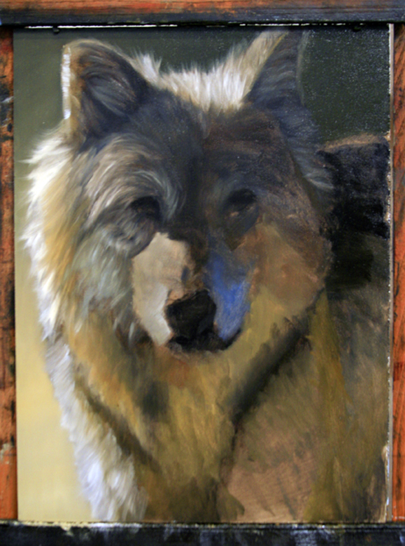
Step Ten: O.K. I am at the finish line. As a final pass I am focused on making finishing value and temperature adjustments, softening any edges that may cause the fur to look stiff and modeling the eyes, nose and mouth. Now is also the time to pull a few fine lines of hair into the wolf. I like to make a few wisps that cross into the background as well as some on the clumps of hair in the light areas for the best effect. Thanks for joining me!
Now, as a friend of mine would say…”Sign it and sell it!”


